Responding to the name Beth, I am studying my degree of Textile and surface design at Cleveland College of Art and Design. This blog will consist of my artwork, things that inspire me and my thought process's. Approach it open minded.
So the other day when my tutor was checking over my blog to see if it was heading in the right direction , she thought that I was although suggested that I 'Blow my own trumpet' so im going to upload some photos of some of the things ive been working on towards a craft fair.Ive been really getting inspired by the whole idea of Day of the Dead (Día de Muertos) with the crazy sparkly embellished trinkets, shrines and fabrics. Im really excited to have my new products and work on show at the craft fair !
When looking at what Designers need to consider when reacting to a brief , we looked at the exterior of people. Judging a book by its cover as some may say. We looked at two 'customers' and their surroundings in the photograph and became really judgmental , and mentally depicted their 'lifestyles' we decided where they shopped, lived, who they provided for, who where their influences? political views?
When designing to a brief you have to consider a lot of basic information when put together will guide your work and help it flourish into what would hopefully be a final design/collection of final designs that the company is happy with.
When meeting with the client;
Introductions - are a must ( in case you need to call them ect)
Research the company you are working for.
The Format- how do they work? Skype meetings? phone calls?
How do they want you to present your work? mounted? digitally? ect.
Do they want you to brand your own work? Or does the company have their own branding methods they want to use?
DEADLINES - Make sure you will be able to meet the deadline before you commit !
Amends - ensure that you discuss your rates of amendments (do this before you agree to anything and start the project!) This will ensure you don't waste your time and break even when you need to earn a living and make a profit.
Trends
Spring, Summer , Autumn, Winter.
Colour of the fabric, fabric weight , initial design , type of clothing , and the cut of the garment. (some of these apply to the UK )
Gift and surface designer/maker ( the work will be less weather influenced)
Holidays and the school calender will be more of an influence.
When looking for the trends that are going to inspire the designers there are books and journals with he predictions in.
Today Music, film , global culture , cross over design trends and social trends influence us!
The use of pan-tone colours is much more apparent and keeps the accuracy of colours higher.
Trend sites
A few years ago i foound this amazing site , which enables you to collect images (default or your own) to create a 'trend' collage. You can add colour charts and furniture mixed with fashion garments/accessories to create quite a sophisticated collage.
Here are a few examples created by different member of the website ; http://www.polyvore.com/
Here is a quick collage that I made using the Polyvore website, I collected a series of images that would help inspire my latest project which I am currently doing. Im making a lot of over the top Mexican shrine boxes that are all sparkly and bedazzled, its a really fun project and the boxes will be for sale as part of a collection for a craft fair!
Gemma Correll is an illustrator whom I love a lot , her very childlike and simple illustrations along with fabulous puns have me cracked up. I noticed over the last year or so her illustrations on much more functional things, and more stationary's like sellotape. Her keen eye for whit and cute drawings are very popular and they have even been seen on t-shirt bags and other accessories. Whenever I go into paper chase I always hunt for a Gemma Correll card as I simply love the humor that she involves in her illustrations.
The Carousel Show
The carousel show (http://www.notonthehighstreet.com/thecarouselshow/product/owl-stationary-set)
The carousel show (http://www.notonthehighstreet.com/thecarouselshow/product/toadstool-eraser-and-sharpener)
I came across The carousel Show on Not on The Highstreet and instantly fell in love. The colour scheme and themes they use give off the feeling of one with nature. The toadstools are really surreal and really remind me of being a child with a huge obsession with fairies, I think this is why I connected with these products so much.
Bonnie and Bell
Bonnie and Bell (http://www.notonthehighstreet.com/bonnieandbell/product/pencil-sharpener-the-last-log)
Bonnie and Bell (http://www.notonthehighstreet.com/bonnieandbell/product/melamine-plates-butterflies)
Bonnie and Bell have taken somethings from nature and created very contemporary products that are veru quirky. The pencil sharpener is an amazing idea especially once you have got some pencil sharpens inside the dome that look like leaves that have fallen off Autumn trees.These plates are so glamorous , im not sure if its the fabulous butterflies or the highly glossy bright colours the butterflies contrast against , owning these plates would be amazing , however i would dare eat off them to in case they got ruined!
Eden's Paper
Edens paper (http://www.notonthehighstreet.com/edenspaper/product/super-food-plantable-wrapping-paper-pack)
Edens paper (http://www.notonthehighstreet.com/edenspaper/product/sunflower-100-plantable-wrapping-paper)
The bold and intricate wrapping papers made my Eden paper are absolutely delicious I instantly fell in love with all of their collections. They give off a real retro vibe and the use of bold colours and prints is really luring , I really want to buy them all and wrap every single present I ever buy for someone in them, Once the paper has been used for one purpose ( wrapping gifts) it can then be planted into the garden as they have the seeds embedded into the actual paper. You can grow a full garden of beautiful flowers and veg. This idea is fantastic and really creates a more economical way of using wrapping paper and creating something else beautiful.
I chose Memo Illustration to look at because of the simplicity of the designs but the choice of colour scheme and the fact that the designs all look like they have been screen printed. This company really seeks to inform the buyer of the actual surface design and how it has been applied to the object.
I found these beautiful decorations on the Paperchase website and i adore the Totem statue decorations they have a real kitsch vibe and they would look amazing hanging from a heavily decorated tree that looks almost tacky and over the top but fabulous. The wreath is also lovely as it bring a sense of hand craftsmanship and the colour scheme is really complementing on each other. I think the wreath is a lovely idea however I couldn't imagine it being outside on the front door as I may get ruined from the weather.
When exploring fashion Haute Couture is the end you can reach, custom made to measure , beautify embellished and printed and not to mention the high level of craftsmanship.
The first Designer i found that caught my eyes was Manish Arora.
His skill to create such diverse layers and manipulate the extremely embellished fabrics to make such out there collections is wonderful.
The fiery colours used in this garnet is stunning, it comes across very tribal with a real punk feel coming from the white band across the eyes.The layers that Arora has built up to create this almost dangerous yet injured looking buttery fly.This garment is almost like an installation around her body from the huge build up of layers.
Adam Ant (http://www.thejacketshop.co.uk/adam-and-the-ants-clothing/Adam+Ant.jpg)
Adam Ants makeup is what i instantly thought of when seeing the contrasts between the model and her layered couture garment.
Starting from the very bold skirting on this outfit Arora has instantly created a feeling of power and strength by using the fabric to manipulate strong folds. to then build up with what i would think to be a laser cutting of stag which is wonderfully printed on , again in a really bold red.Because of the bold colours , print and the height of the deer head. But a Deer also symbolises innocence, so I ponder as to whether the Designer wanted to create an illusion of power and innocence together.
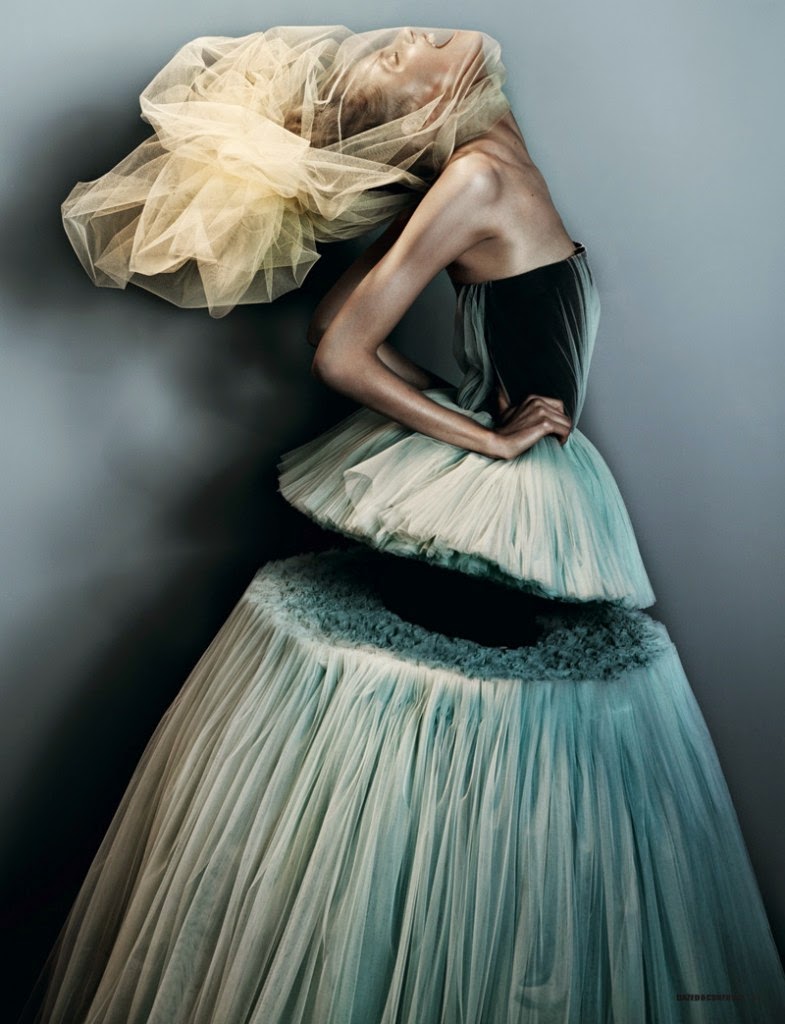
Victor and Rolf
Victor and Rolf (http://www.i-d-j.com/wp-content/uploads/2011/01/Viktor-Rolfe-dress-with-section-missing-from-Dazed-and-Confused-shoot-Feb-2010-785x1024.jpg)
This dress caught my attention as its almost like a traditional prom dress but it has been hacked through the middle creating such contrast between the layers of fabric.It feels like the dramatic chunk that has been taken away form the dress represents a shamble of a prom, maybe Victor and Rolf wanted to make the viewer/wearer feel like they had been abandoned at the prom and everything turned sour and bad, The fabric that caress yet suffocates the models head could symbolise the pressure of how crazy and over the top proms get hence the suffocation.
When seeing the dress that Victor and Rolf created I was instantly reminded by the iconic Vivienne Westwood dress that Carrie Bradshaw wore in the Sex and the City movie when she gets jolted at the altar.Sarah Jessica Parker who plays Carrie Bradshaw on the Sex and the City TV programme and films is also wearing material on her hair but this is a veil yet it also looks like it is suffocating her and Parker is also modelling the dress in a very similar pose as the model who is wearing Victor and Rolf's garment.
Victor and Rolf (http://www.the-futurista.com/wp-content/uploads/2010/10/viktor-rolf.jpeg)
Here are some more traditional and popular prom dress look a-likes but again with holes and shapes hacked out of them to create flaws in the idea of having a wonderful time at a ball/prom/wedding or party.My favourite one is definitely the one i have already spoken about as it is so intriguing how the bottom half of the dress is still in tact and flowing gracefully.The colouring of the netty fabric is very pale i think this is because there is a lot going on with the cut out shapes in the dress and bright and vibrant colours would just distract the mind from the initial idea and thoughts that lay behind the creation of the dresses.
The creation that Hussein Chalayan designed for this show is absolutely breathtaking and so functional in so many ways, this is not the only collection he has done that has proven to be so dynamic and useful, I chose this catwalk show specifically because this dress its self was transformed into multiple dresses throughout the performance.It is mind blowing how the designer uses a petite computer system under all of the dresses to help them transform through 3 decades of each dress.
Christian Lacroix
Christian Lacroix (http://images.nymag.com/images/2/daily/fashion/08/07/02_threeup_lg.jpg)
This Lacroix collection was one i chose because I wanted to point out how relevant it is for designers to not only create clothing but a lot of the money is made from creating accessories, and this collection especially the green dress reflects on the designers perfume range . But other accessories fall under the same visual influence as the clothing. for example this candle.
Christian Lacroix (http://www.mimifroufrou.com/scentedsalamander/images/Welton%20London%20Candle%20-%20Nuit%20Gitane_Christian_Lacroix.jpg)
David Koma
David Koma (http://www.google.co.uk/url?sa=i&source=images&cd=&ved=0CAUQjBw4YQ&url=http%3A%2F%2F2.bp.blogspot.com%2F-boSndsgliJE%2FTWWeYsS972I%2FAAAAAAAABKQ%2FZh1ioHqaT0Y%2Fs640%2FLFW%2BDavid%2BKoma%2B2.jpg&ei=7-ZIVL7XNsOQ7Ab4yoAg&psig=AFQjCNGG6C6Mx-8Xt_WMLTaX6kc7vDCDpg&ust=1414150256018670)
David Koma(https://blogger.googleusercontent.com/img/b/R29vZ2xl/AVvXsEgBNS-c_raAeOnVrD5E0Oq5QabfEps8cTsx9uJH0lEsHatuiF8fnh6hyphenhyphenA7yOdR95ZW5GFAhF6pgptO6YN2UcXDGbfta1NRjI7uUbsxpbsNchIa-yZytUMbbRS7Piez03Btb8KePPOdWDXLo/s1600/David-Koma.jpg)
David Koma has really taken me a back with his very strong sense of style and design. The structural design elements included in this collection is fabulous, the designs are so geometrical and symmetrical. it seems pretty obvious that his collections are influenced by architecture, however David himself described his work in this way.. "I like to see the female body looking good but at the same time I like to feel that they are wearing something timeless with an element of art attached: something unusual but not over the top. Trying to combine all of these is my design aim."
David Koma (http://www.stylist.co.uk/home/stylist-talks-to-david-koma)
So today I was shown Oh Comely's blog, I was already well aware of the magazine and how pure and beautiful its spreads are. A feature on the blog was for people all over the world to hand in some details and a brief message about them to do a swap and eventually send some really cool things to a stranger in hope to make a new friend on the same wave length as you.
So without a second thought of course I signed up, im super excited to get my swap buddies details of what they like to gave me some inspiration to make them some cute little things and buy some cool things with a budget of a whole ten pounds.
In this gift box that I will be creating I have to include a modern day message in a bottle , so this could be a USB stick with some photographs , music or a recording etc.
I also need to scan an image of everything that is in my bag and then a wintery treat/ treats with the budget of ten pounds. I will carefully choose what to put in my box by reading what t=my swap partner likes and has interests in.
(http://www.ohcomely.co.uk/blog/1015)
"Heyoo! My name is Beth, 19 From the North East, studying textiles and surface design at Cleveland College of Art and Design. Purple hair, lots of piercings, lots of tattoos and a crazy sense of style. I really enjoy quirky illustrations, listening to music eg: pixies, neutral milk hotel, Goat, System of a Down. Arrested Development, American Horror Story and breaking bad are some series I watch/watched religiously. The Lost Boys, Pretty Woman, Donnie Darko and Romeo and Juliet are some of my favourite films. I feel like I am really easy going to get along with the three things I place so close to my heart are cats , chocolate and bacon. I love to draw with dark pencils and thick acrylic paints and even mess about with stitches to draw using my sewing machine. I'm hoping that this spontaneous letter may actually prove to be successful and I find a really awesome person who I can send some cool gift too!
Peace! x "
If your interested in getting in on the action visit the Blog that started this frenzy off and get signed up y'all!!
When looking around at high end Textile and surface designers to help influence my creativity and inspire me I came across lots of beautifully printed, stitched and embellished fabrics and wall coverings.
Some of the products are more simplistic and repetitive compared to other more detailed ones , however simplicity is also a splendid thing.
Mulberry Home.
Mulberry home (http://www.gpandjbaker.com/mulberry-home/en/bsc/view-brochures/)
My starting point is this fantastic set up, The couch is not only covered in a dramatic and loud fabric that incorporates lots of detail and repetitive pattern , the backdrop of the tartan curtains and the decor of the actual interior very much so complements it. I was drawn to this couch by the choice of colour scheme that was chosen on the fabric and the fact that you can take something that is an everyday item such as a couch which becomes worn, saggy and boring and turn it into an installation piece where everything else in the room revolves around it.
Timorous Beasties.
I have had a huge love for Timorous Beasties for a long time and it really enchants me that they still use traditional printing methods to create some amazing collections. The ranges of colour schemes they use is fantastic and creates a huge collection which im sure at least one thing will tickle everyone's fancy whether your wanting a very bold mirrored pattern or a pale earthy coloured wall hanging with very traditional prints that look like they are almost drawn or etched onto the paper.
Watts have also created some very intricate patterns using repetitive patterns using what looks like very traditional looking images with a contemporary twist using bold colours that would of necessary been used with those types of wallcoverings in a traditional sense. I really love how they have used a forest green and dirty yellow especially, I feel like this wallcovering more so would definitely be found on a wall in my house.
Sanderson is a very well known company which is up on par with Morris , again i have also had a huge love for this company especially some of the new products I came across whilst having a wander through the website. Some of the designs I came across are very painterly and look almost like a piece of art, imagine how delicious they would look on the walls of your house!
This design in particular stuck out to me like a sore thumb, It comes across so delicate yet harsh it almost seems as if its a very delicate pattern of ink in water merging more drastically together throughout the piece when it becomes more harsh. The design is very illustrative and comes across almost as a laser cutting, I can very much imagine this pattern on some velvet using devore paste to remove some of the more lighter motifs, which would create such a delicate a fragile piece that would be ever greater in front of a window as the light would seep through the transparent bits.
When researching the two words 'Vitreous' and 'Efflorescence' in a sense of completing a drawing/design , I initially decided the atmosphere would feel sparkly, magical and mythical , and the drawing would consist of heavily layered coloured pencils and mixed media's. The objects I would draw would be crystals , metals, flowers that are blooming and water. When I thought in more depth the composition of objects to draw which would represent 'Vitreous efflorescence' would be large and central as if getting all of the attention on a very light /transparent almost background. Jasmine blooming flowers bloom (enlighten) when in hot water and I felt that the flower surrounded by the water would create some really nice transparent imagery for this drawing project.
I collected this image from this amazing tea website which sells exsuisite teas... https://www.wanlingteahouse.com/shopimages/products/extras/tea_jasmine/tea_gyhc-blooming-jasmine_moli-xian-tao-(1)_800x800.jpg




_800x800.jpg)